Cowgirlblues
Cowgirlblues
Woodstock, Cape Town,
South Africa
Project Summary
The aim of this project was to rebrand cowgirlblues in such a way that would elevate the garments to the level of couture status, which they so deserve.
Cowgirlblues hand dyes each fine wool item that they create, so each item is entirely unique and cannot be replicated in exactly the same way. Cowgirlblues prides itself on the highest quality, natural wool products, so the logo mark should reflect this high quality dye and fashion house.
Credits
Bridget Henderson – Founder
My Role
Brand Identity Design
Publication Design

Stationary and postcards
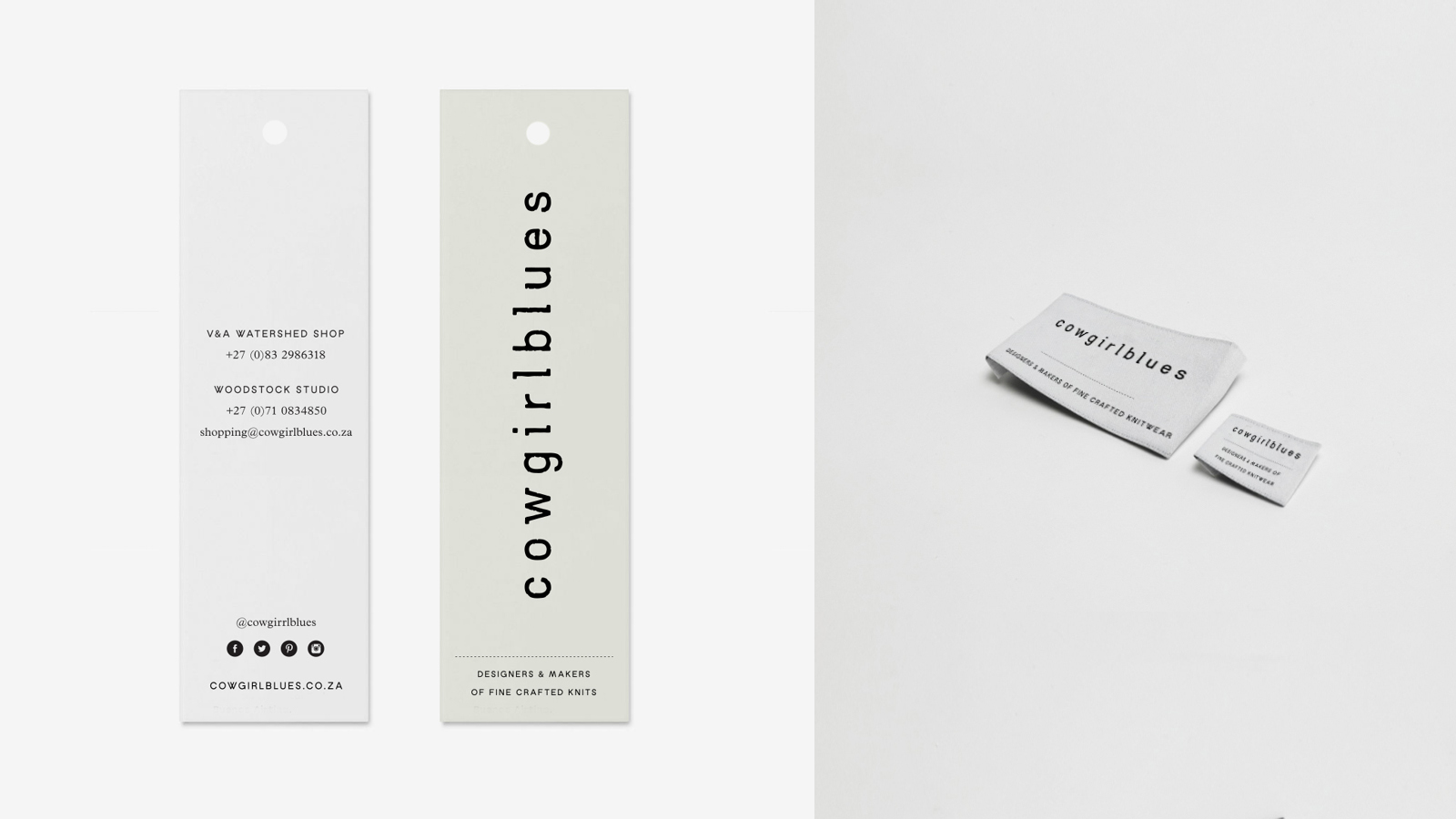
Swing tags and clothing labels