Sama Sama
Sama Sama
Cape Town, South Africa
Project Summary
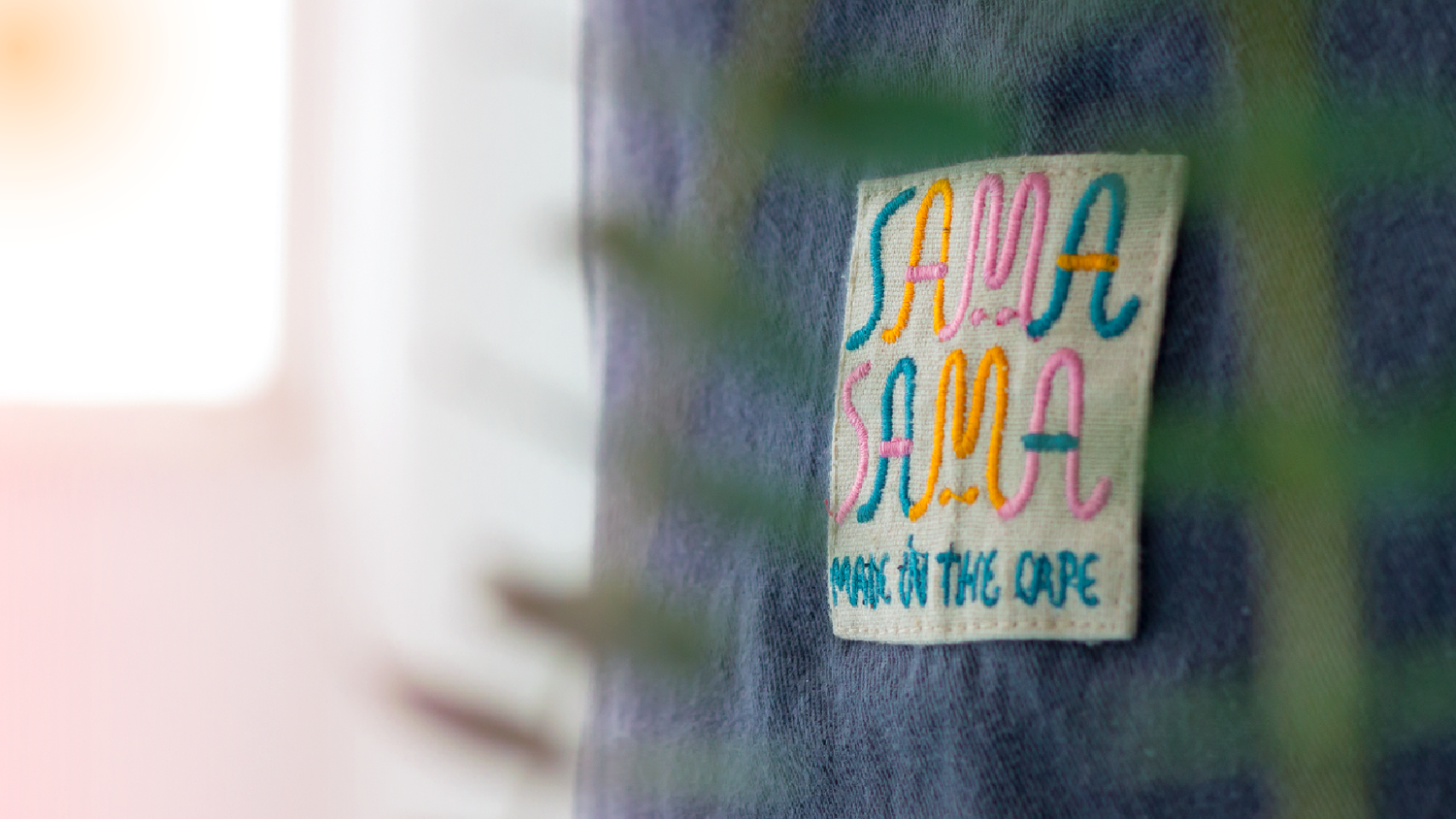
Brand identity for the fresh new label focussed on compassion, sustainability and wearability. They wanted the clothes to be fun, fresh, inclusive and compassionate to the body of anyone who wears them, the brand identity should reflect this spirit and ethos.
The label was inspired by the meaning of the phrase Sama Sama meaning ‘you’re welcome’ in Balinese. This forms the basis for a well-spring of graphic exploration, and through a variety of iterations we landed on this final result: a front and back label for a pair of unisex dungarees available in hemp, cotton or canvas.
@samasamascpt
samasama.co.za
What I did
Art Direction
Branding
Visual Identity
Illustration
Web Development
Year
2017
Credits
Kim Lardner Burke – Cofounder
Max Basler – Cofounder
Leon Basler – Photography
Daniela Puccini – Design Consultant
Alex Arsenault - Developer


MADE IN THE CAPE