Starke Brews
Starke Brews
Durbanville Hills, Western Cape,
South Africa
Starke Brews approached me to develop the Starke Brews Brand Identity. The brief was to develop a classic timeless mark, that speaks of the generations old family farm, and carries that history with it with into new farm enterprises.
Logo Design
Branding Identity
Concept Development
Packaging Design
Naming
Copywriting
Credits:
Robert Starke – Founder
Daniela Puccini – Design Consultant
NEW RURAL
Classic, Timeless,
Fresh
The brief for Starke Brews was to create something that illustrated the Starke family’s legacy on the land, having created and sustained a noble livelihood there for many generations. The logo and the rest of the language should reflect that. So I approached it as something like a family crest.

Consciously brewed with a passion for sustainable practises
Starke Brews is a micro-brewery project started by founder Robert Starke on his multi-generational farm in the Durbanville Hills, Western Cape, South Africa.
People travel great distances to the Contermanskloof farm, where the beer is lovingly crafted, to ride the numerous, world-class downhill mountain bike tracks. This is where the concept for the beer labels was born.

The Beers

EVERY BEER HAS A STORY
Through our discovery process Starke Brews shared stories from the farm, that recall the history and uniqueness of place. The names of each beer all came from this rich narrative. Drawing from the present main activity on the farm i.e. mountain biking, or unique characteristics of the place and all that once roamed the lands of the Contermanskloof and at times still do…
The names evoke rich, imaginative visuals and so each label developed its own distinctive character, linked to the next by the authoritative and distinctive Starke Brews logo mark and typographic language.

BLACK RHINO
Black Rhino’s once roamed the lands where the Starke family’s farm is situated. Now the only place on the farm you could hope to see one is on this beer can.

CHAIN BREAKER
There are some hills so tough to climb, but this chain breaker could make your day.
Heritage is an important aspect of the Starke Brews brand and so the challenge was to communicate a feeling of heritage whilst still looking uniquely fresh and contemporary.

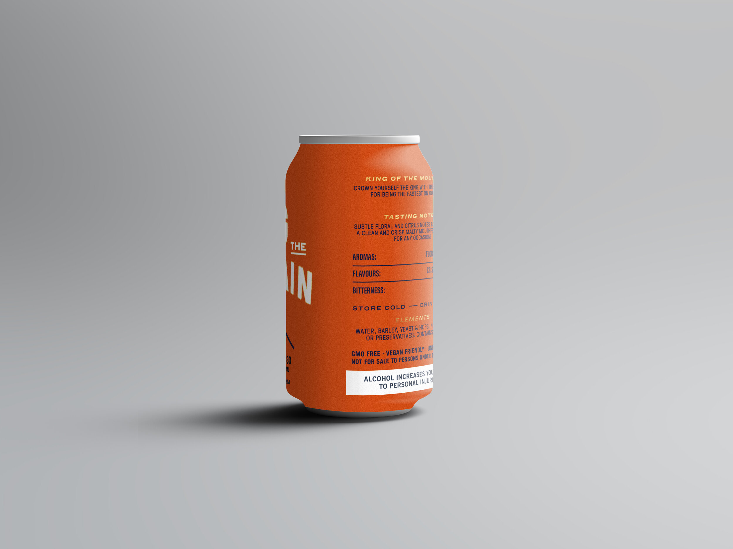
KING OF THE MOUTAIN
Celebrate being the fastest on the trail with this golden ale. The crown was rendered referencing the stylistic approach from the Starke Brew’s logo.

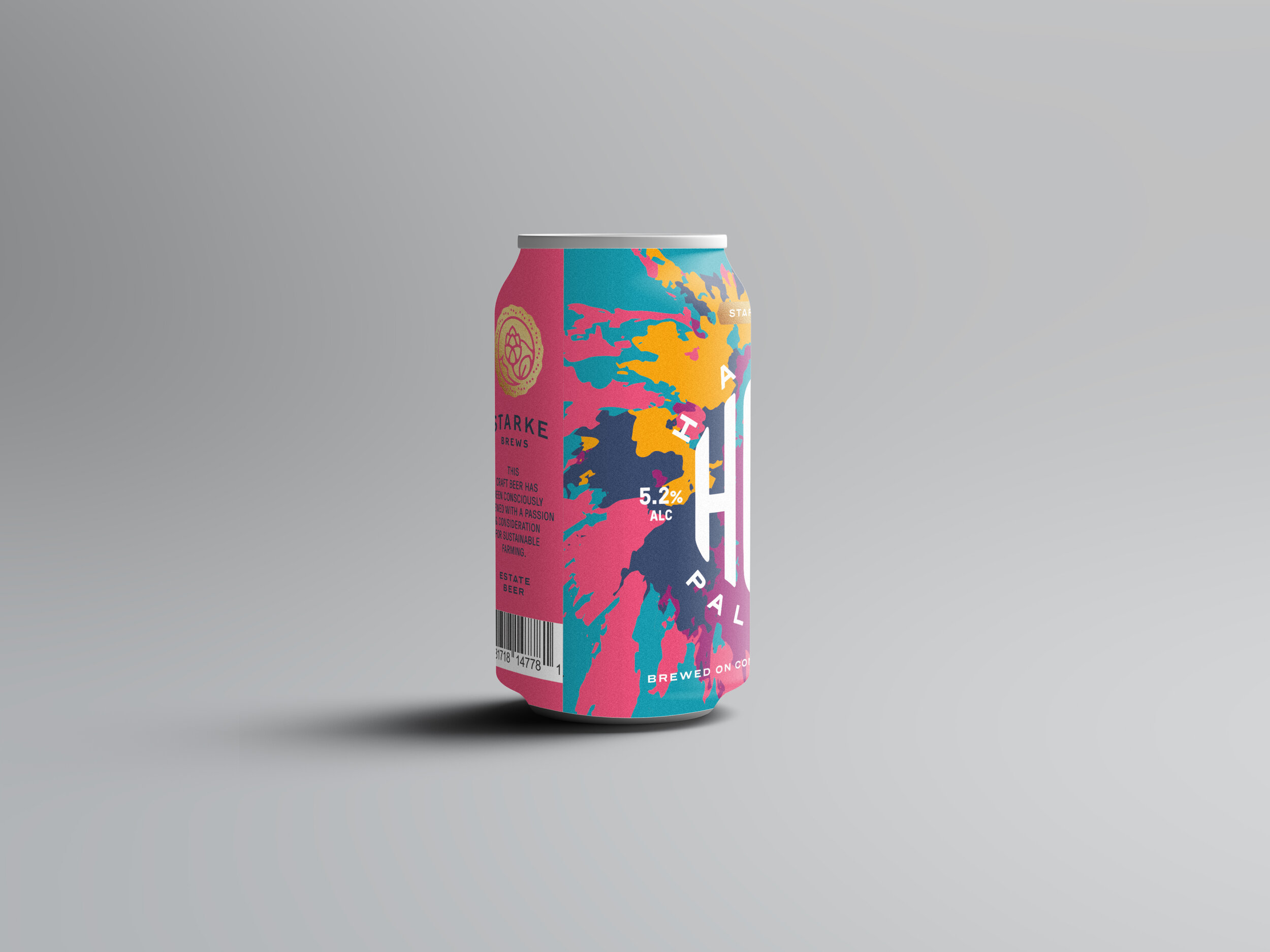
HAPPY HOPS
Named after a downhill trail on the farm, this hoppy beer is a flavour explosion. Adventurous colour use and stretched type forms inspired by psychedelic imagery of the 1960’s were developed to illustrate the characteristics of this beer.
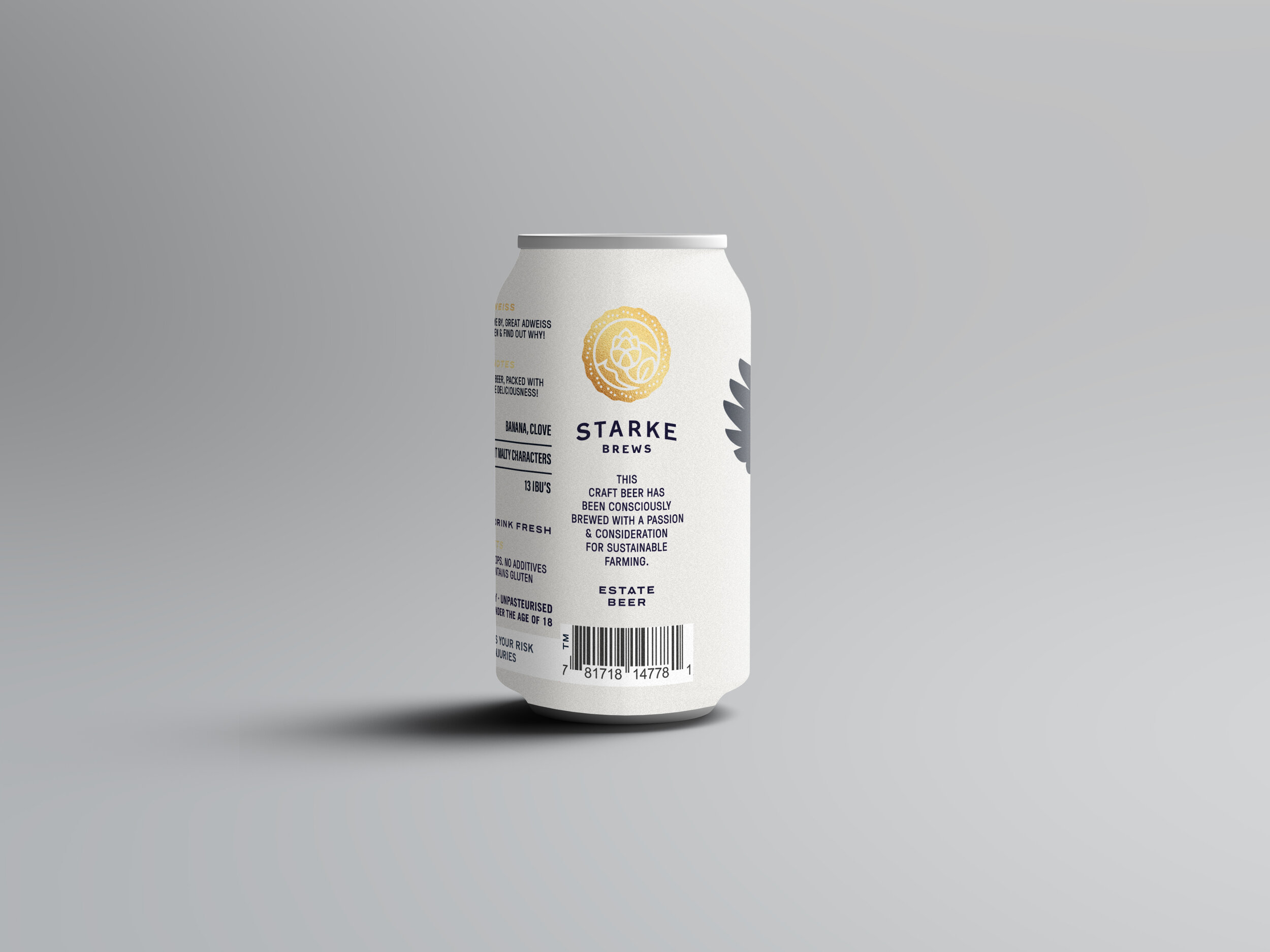

ROB’S ADWEISS
Rob, the brewer and founder, is as wise as the rare Eagle Owl, when it comes to advice on all things trail riding. This became the concept to visualise Starke Brew’s Hefeweizen.
*Eagle owls are frequently sighted on the Contermanskloof farm